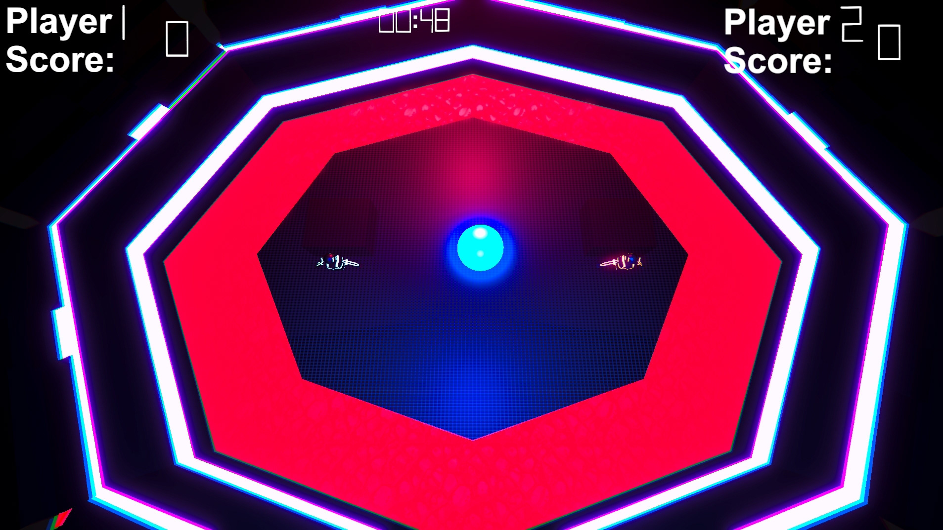
Interface Redesigns!
The primary goal of my redesign work was to modernize an older title/client and bring it into the future using key elements. The elements these pieces were judged and improved on were their white space, hierarchy, proximity, color, alignment, repetition, unity, and typography.
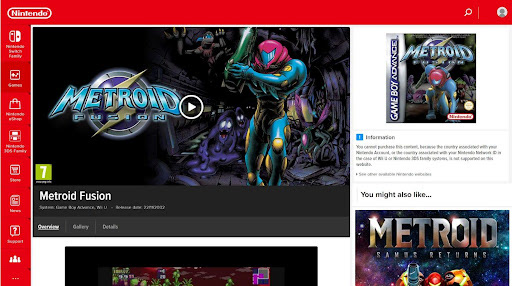
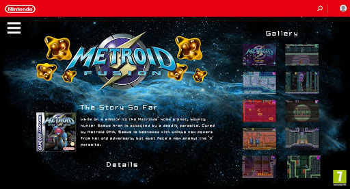
Metroid Fusion
Before
After
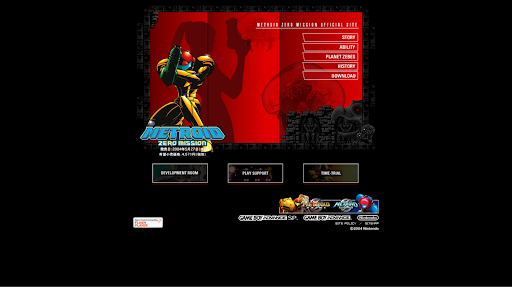
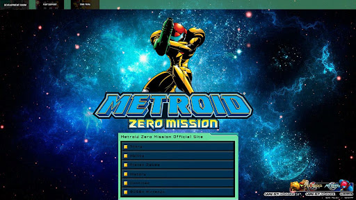
Metroid: Zero Mission
Before
After
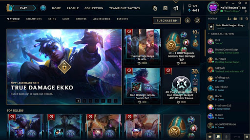
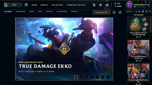
League of Legends' Shop Redesign
Before
After
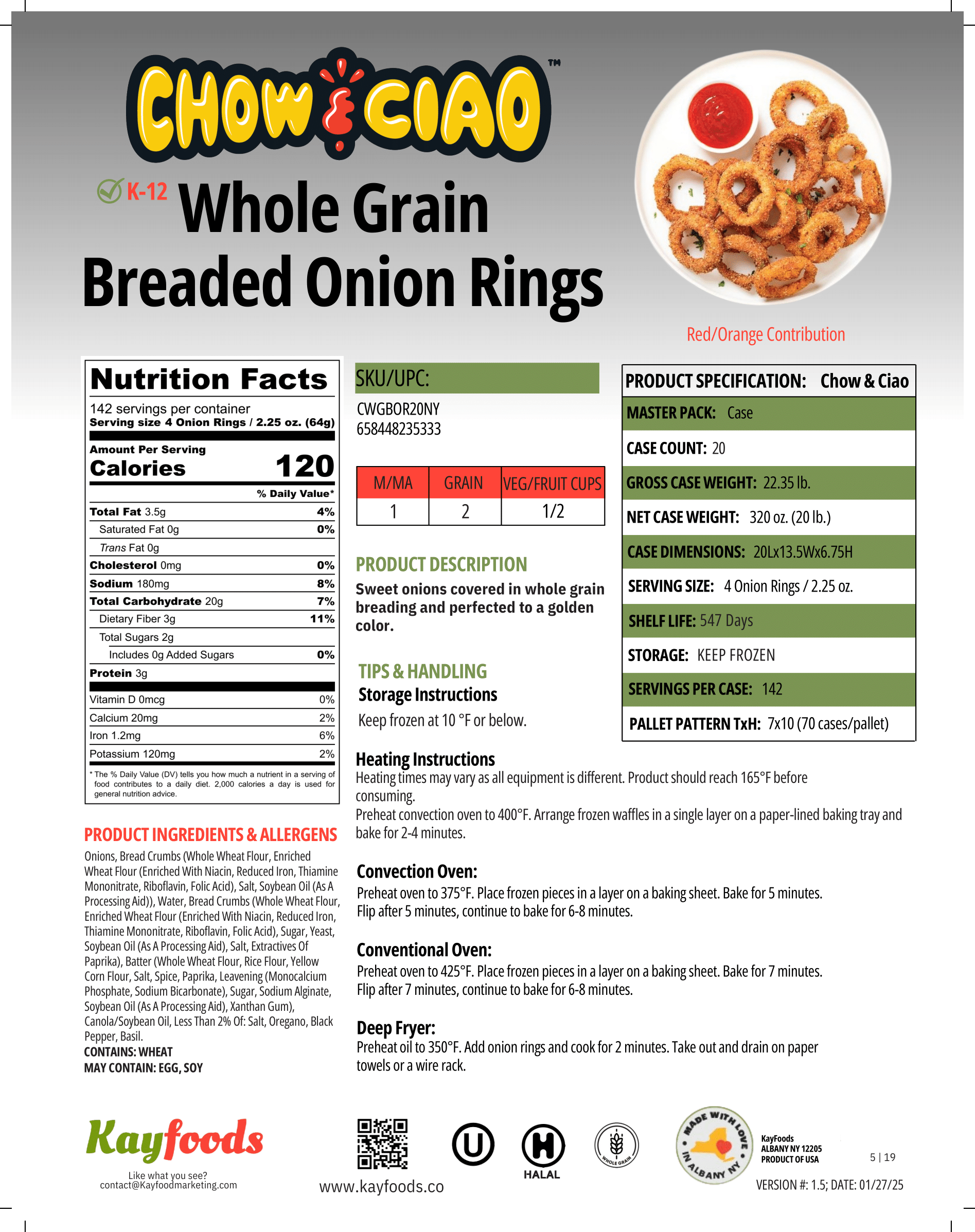
Complete Kayfoods Design Overhaul!
Click on any photo you're interested in and get a full breakdown of what it is and why it was made!
These went through a couple of iterations, but overall, the company wanted all of their distribution partners front and center! I even have a version with a photo of the employee!
These went through a couple of iterations, but overall, the company wanted all of their distribution partners front and center! I even have a version with a photo of the employee!
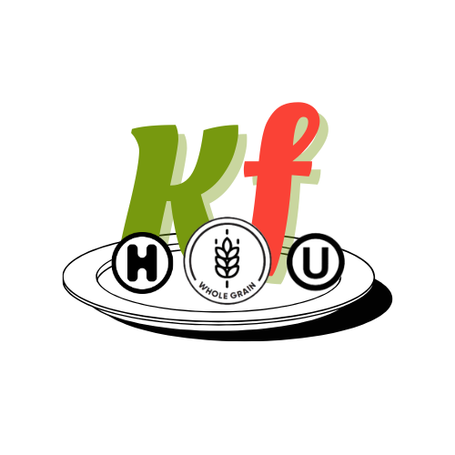
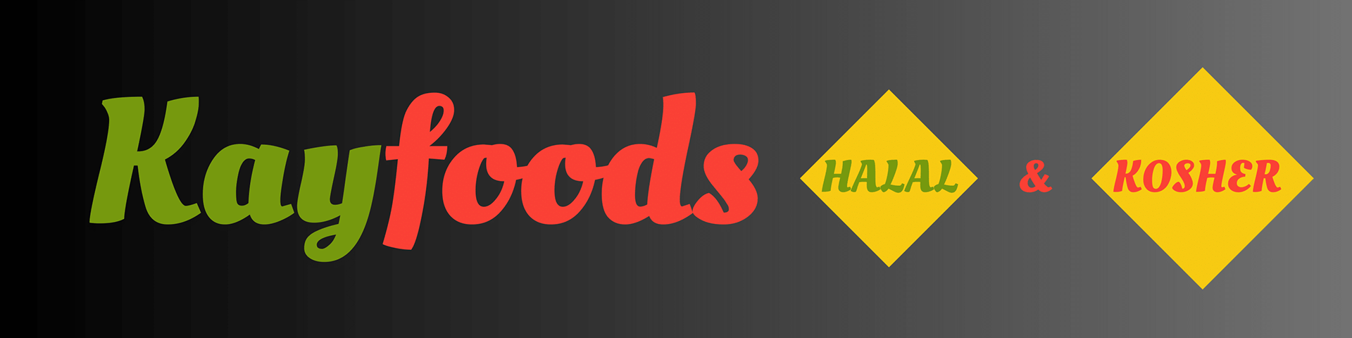
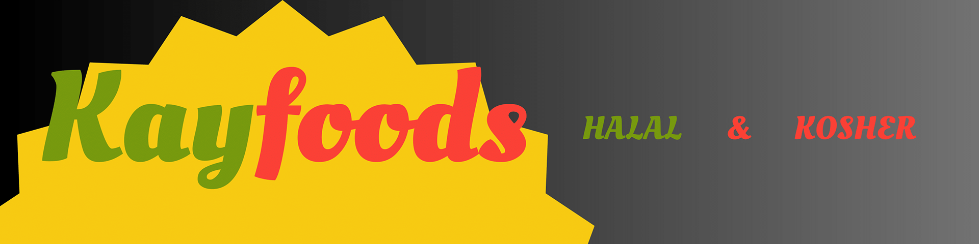
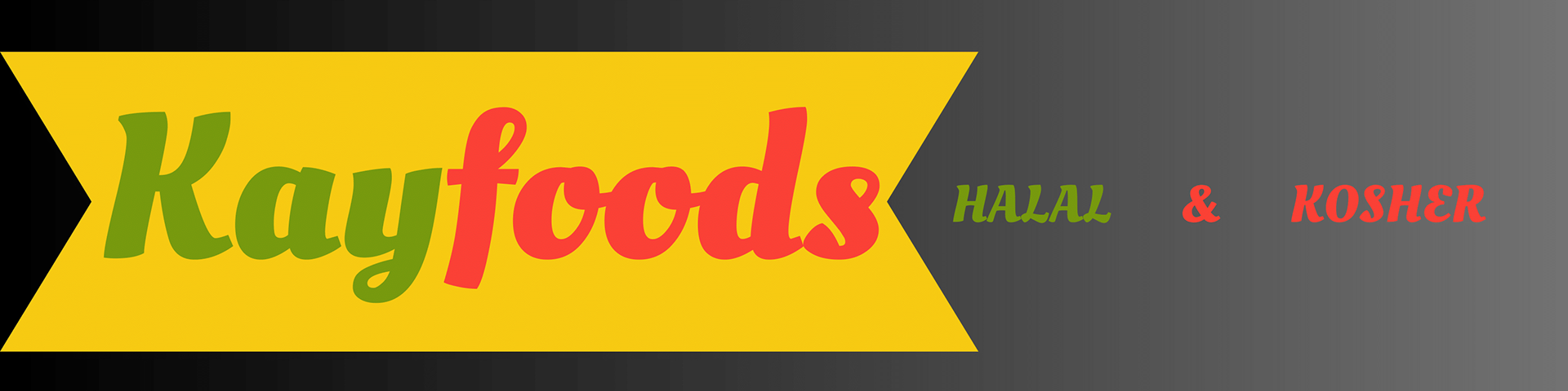
A potential change in our company logo. Our old apple shaped logo was getting very dated.
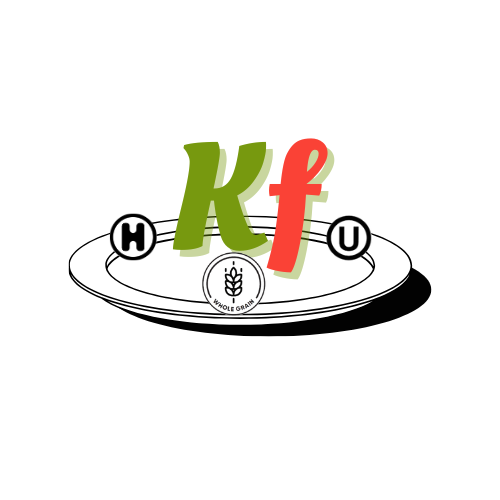
A potential change in our company logo. Our old apple shaped logo was getting very dated.
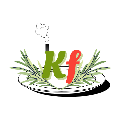
A potential change in our company logo. Our old apple shaped logo was getting very dated.
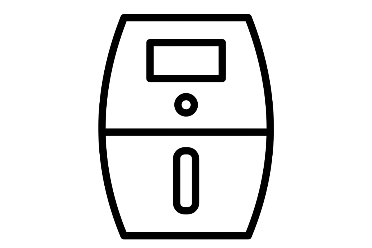
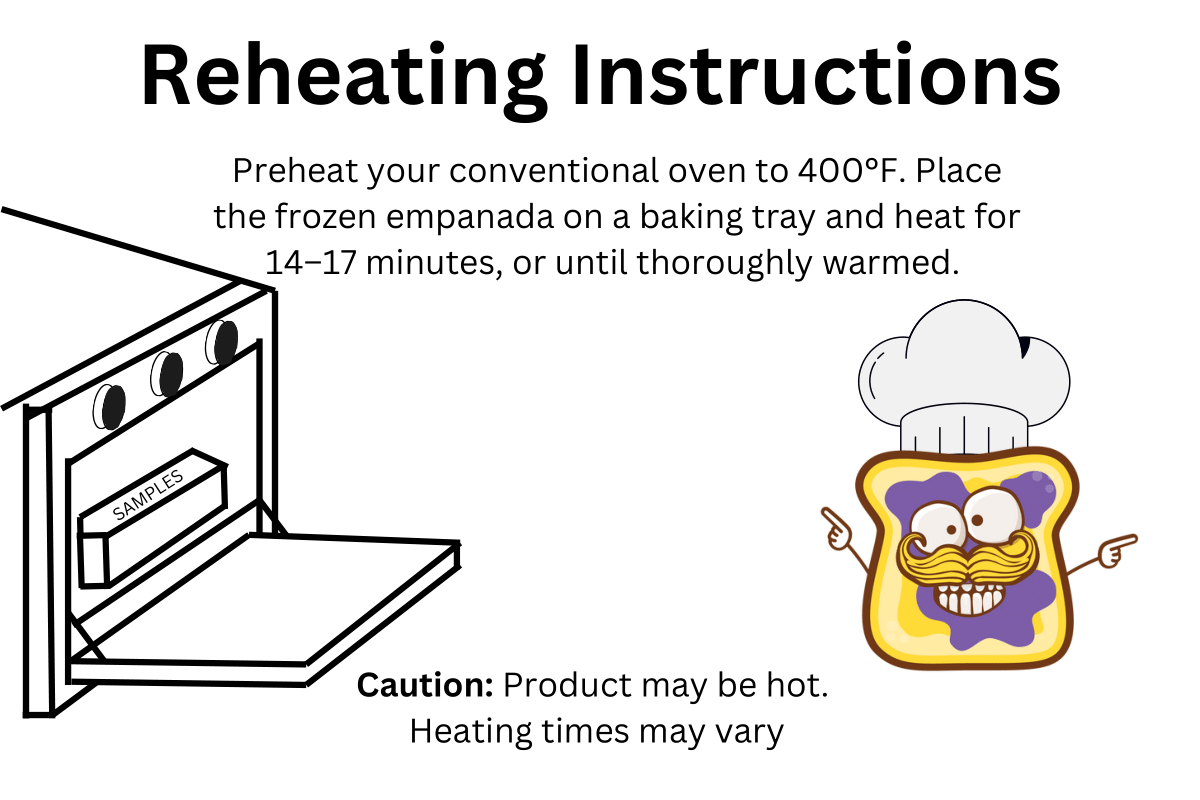
Each one of these graphics were made with the intent of using them as aids on the spec sheets! It would help signify the reheating instructions section!
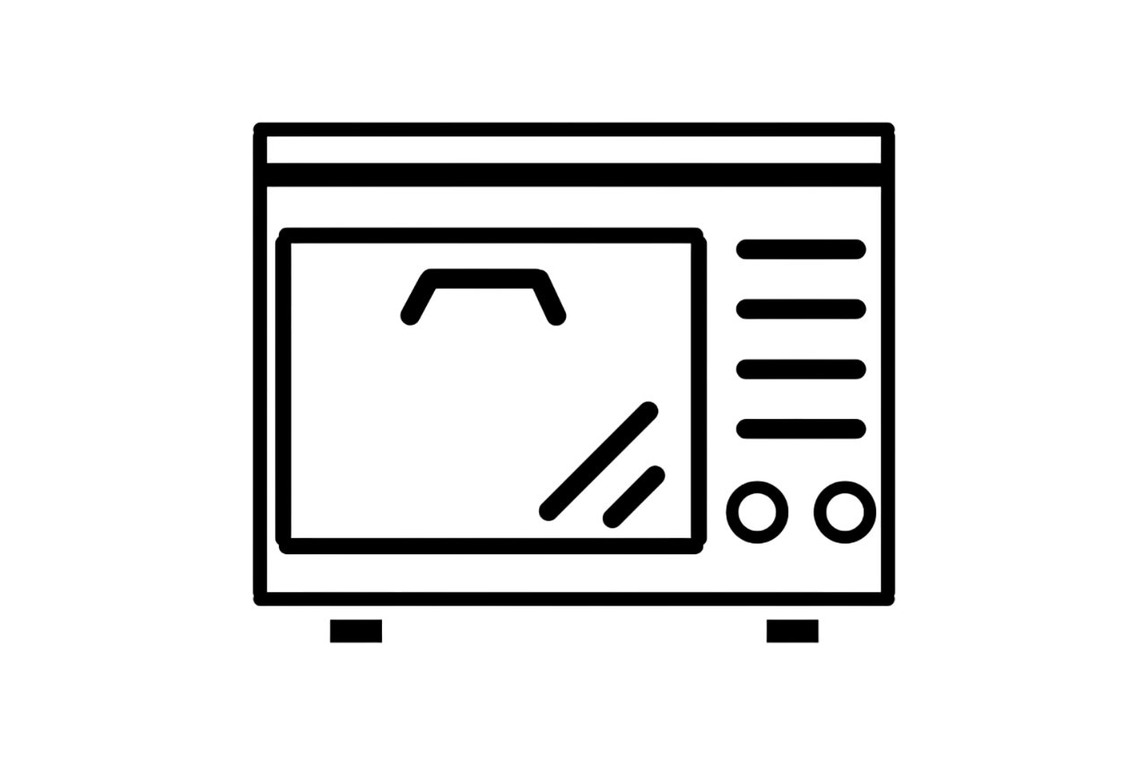
Each one of these graphics were made with the intent of using them as aids on the spec sheets! It would help signify the reheating instructions section!

Each one of these graphics were made with the intent of using them as aids on the spec sheets! It would help signify the reheating instructions section!
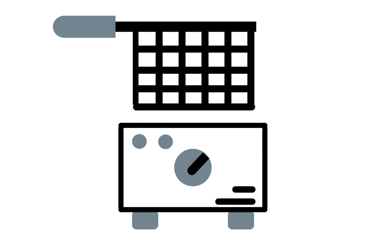
Each one of these graphics were made with the intent of using them as aids on the spec sheets! It would help signify the reheating instructions section!
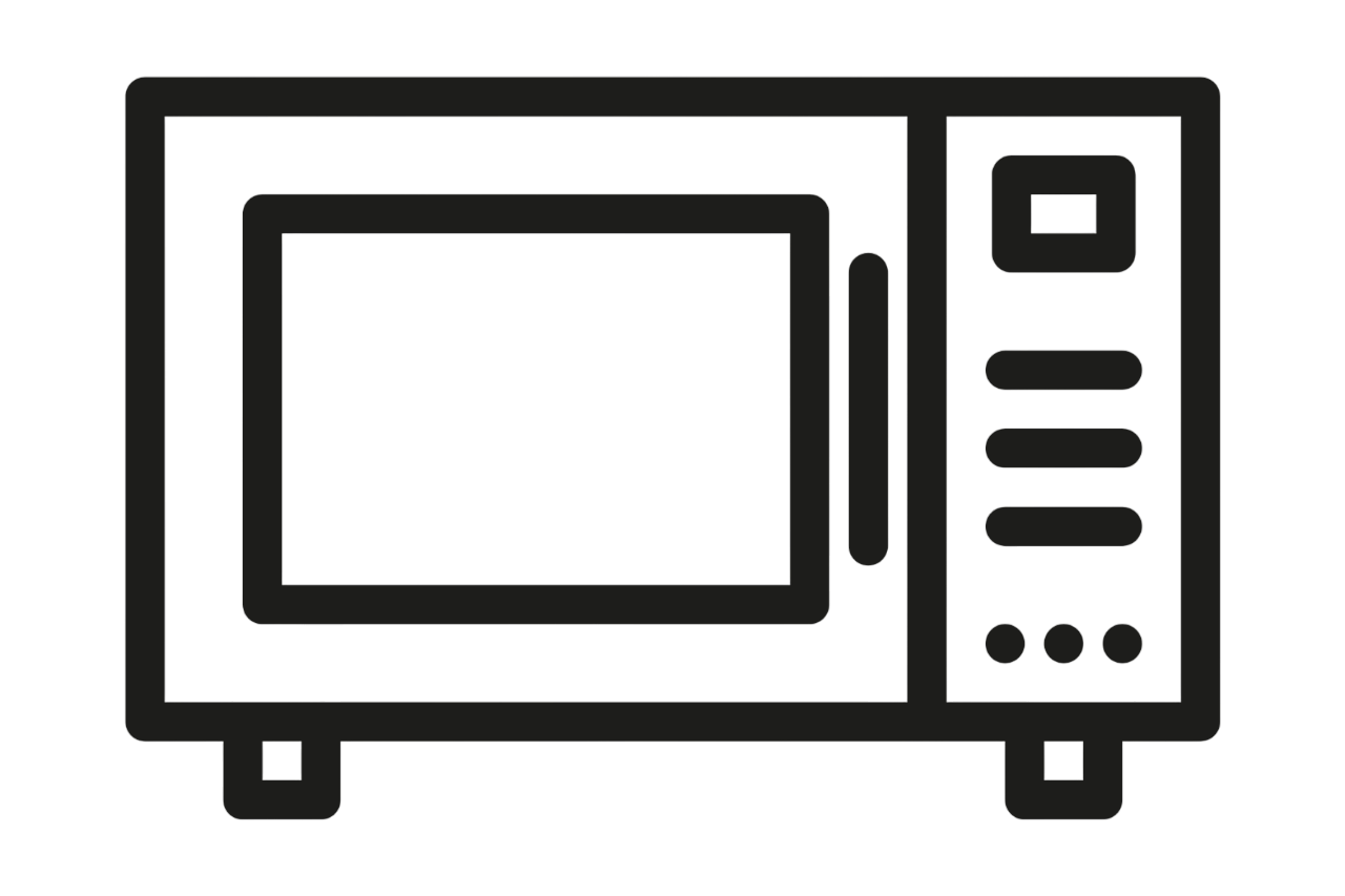
Each one of these graphics were made with the intent of using them as aids on the spec sheets! It would help signify the reheating instructions section!
These are drafts for the new banner design we'd use at shows! This banner would hang off the table. The company wanted something striking with the colors of the company (Yellow, red, and green)
These are drafts for the new banner design we'd use at shows! This banner would hang off the table. The company wanted something striking with the colors of the company (Yellow, red, and green)

These are drafts for the new banner design we'd use at shows! This banner would hang off the table. The company wanted something striking with the colors of the company (Yellow, red, and green)
These are drafts for the new banner design we'd use at shows! This banner would hang off the table. The company wanted something striking with the colors of the company (Yellow, red, and green)
These are drafts for the new banner design we'd use at shows! This banner would hang off the table. The company wanted something striking with the colors of the company (Yellow, red, and green)
These are drafts for the new banner design we'd use at shows! This banner would hang off the table. The company wanted something striking with the colors of the company (Yellow, red, and green)
These are drafts for the new banner design we'd use at shows! This banner would hang off the table. The company wanted something striking with the colors of the company (Yellow, red, and green)
These are drafts for the new banner design we'd use at shows! This banner would hang off the table. The company wanted something striking with the colors of the company (Yellow, red, and green)
These are drafts for the new banner design we'd use at shows! This banner would hang off the table. The company wanted something striking with the colors of the company (Yellow, red, and green)
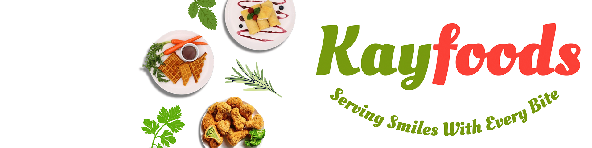
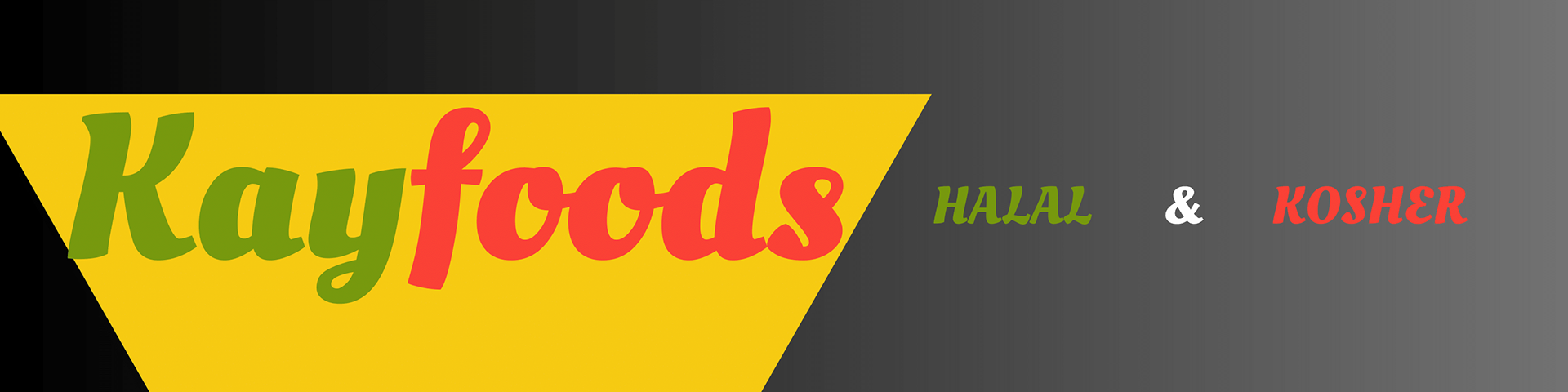
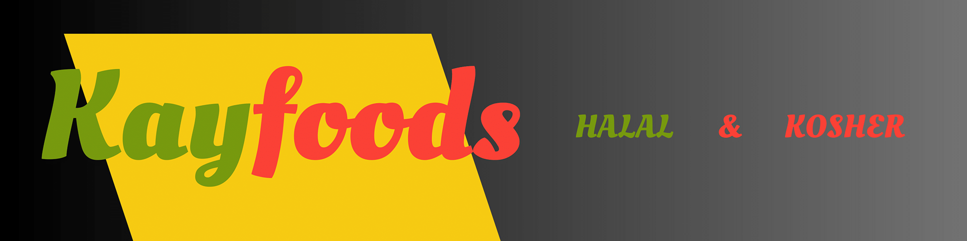
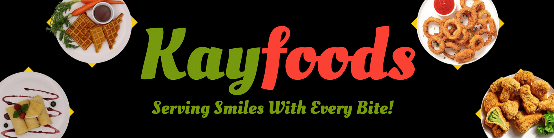
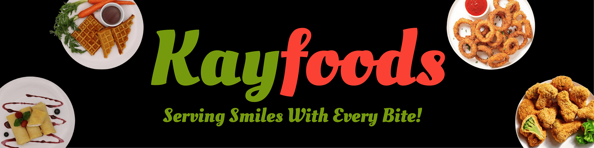
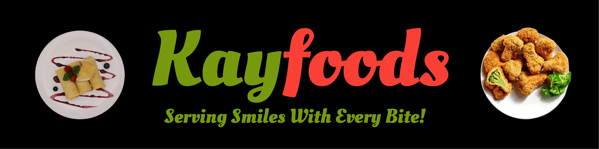
This was one of my first projects made. It's a Linkedin banner header for the sales people to use. Our old one was very outdated and pixely.
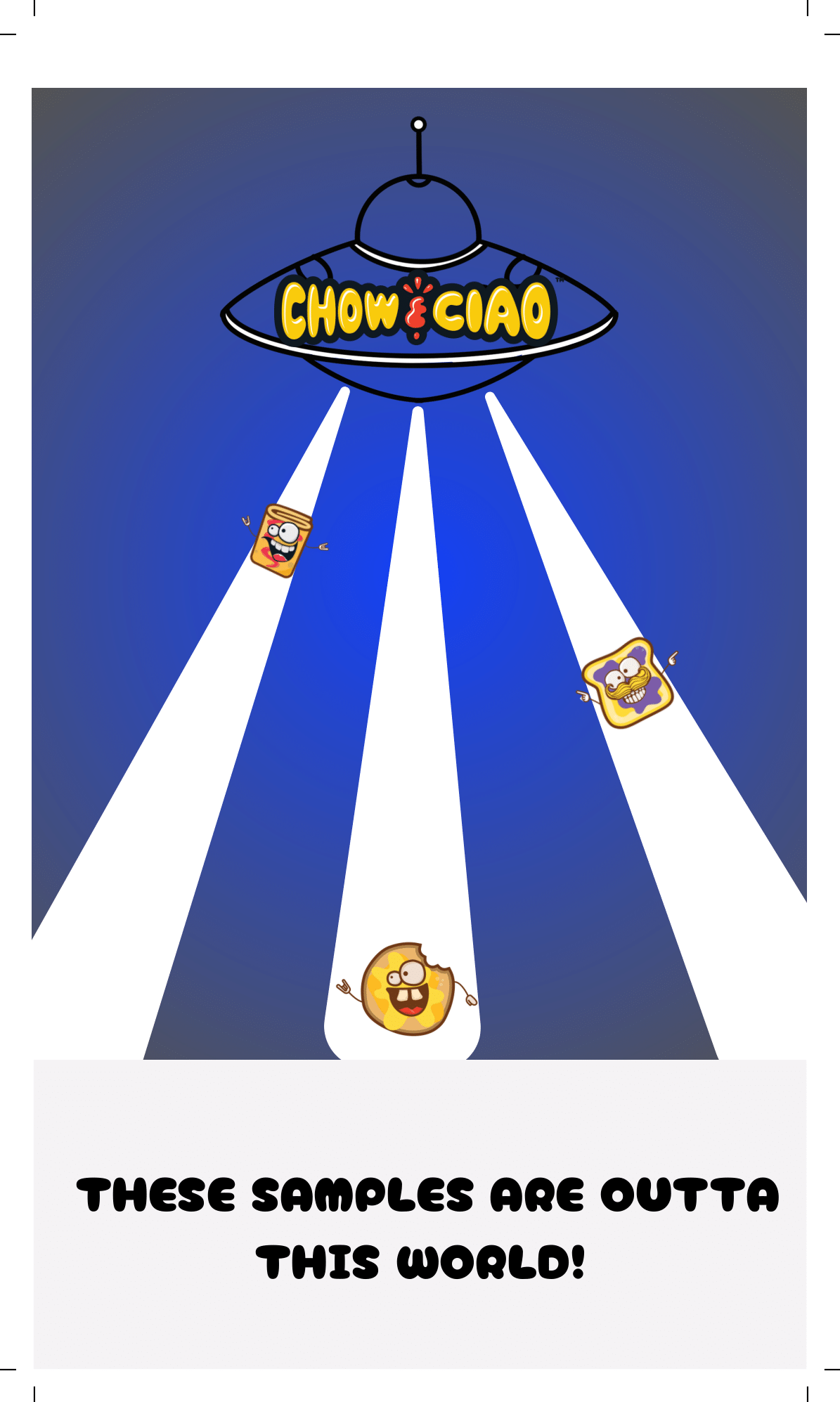
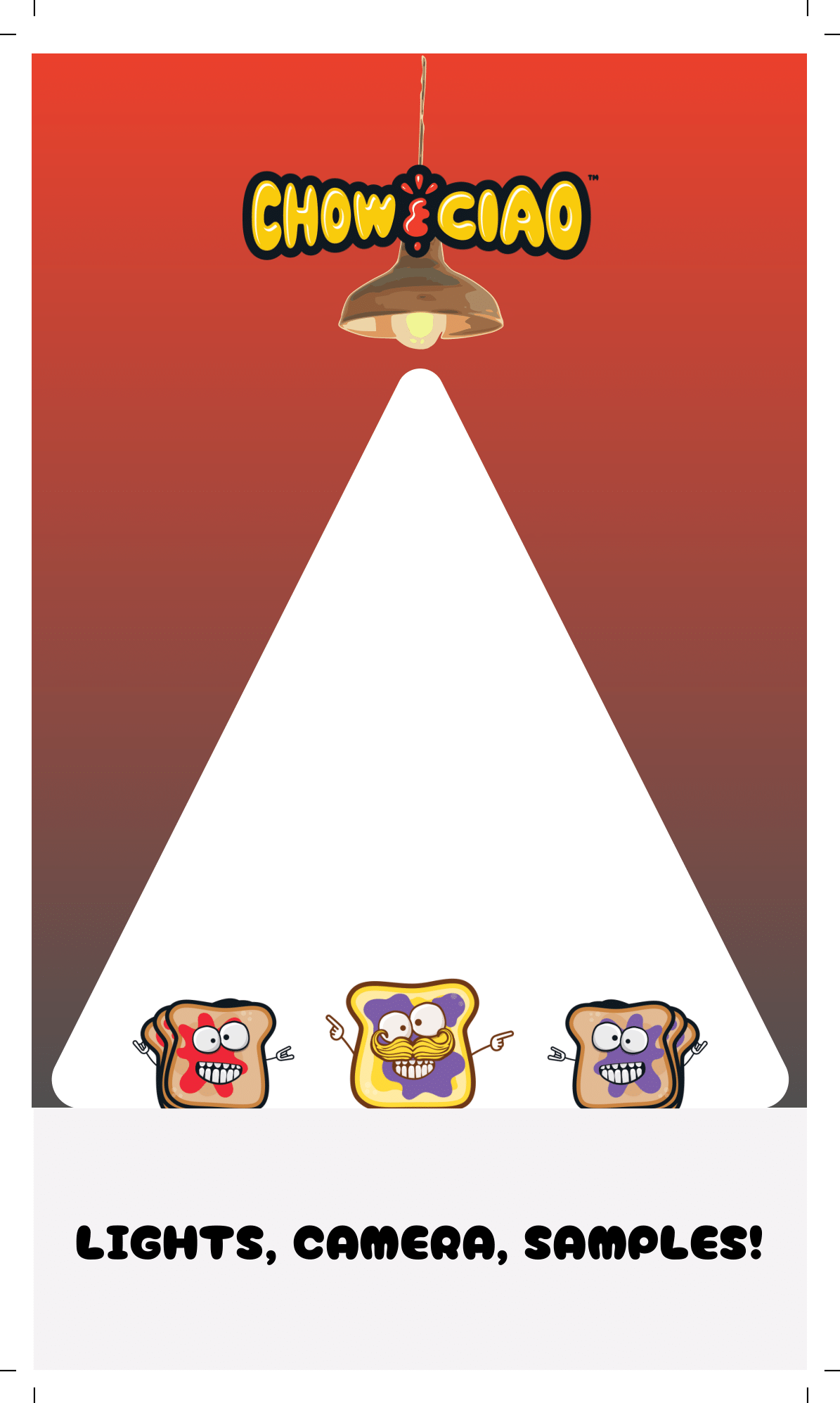
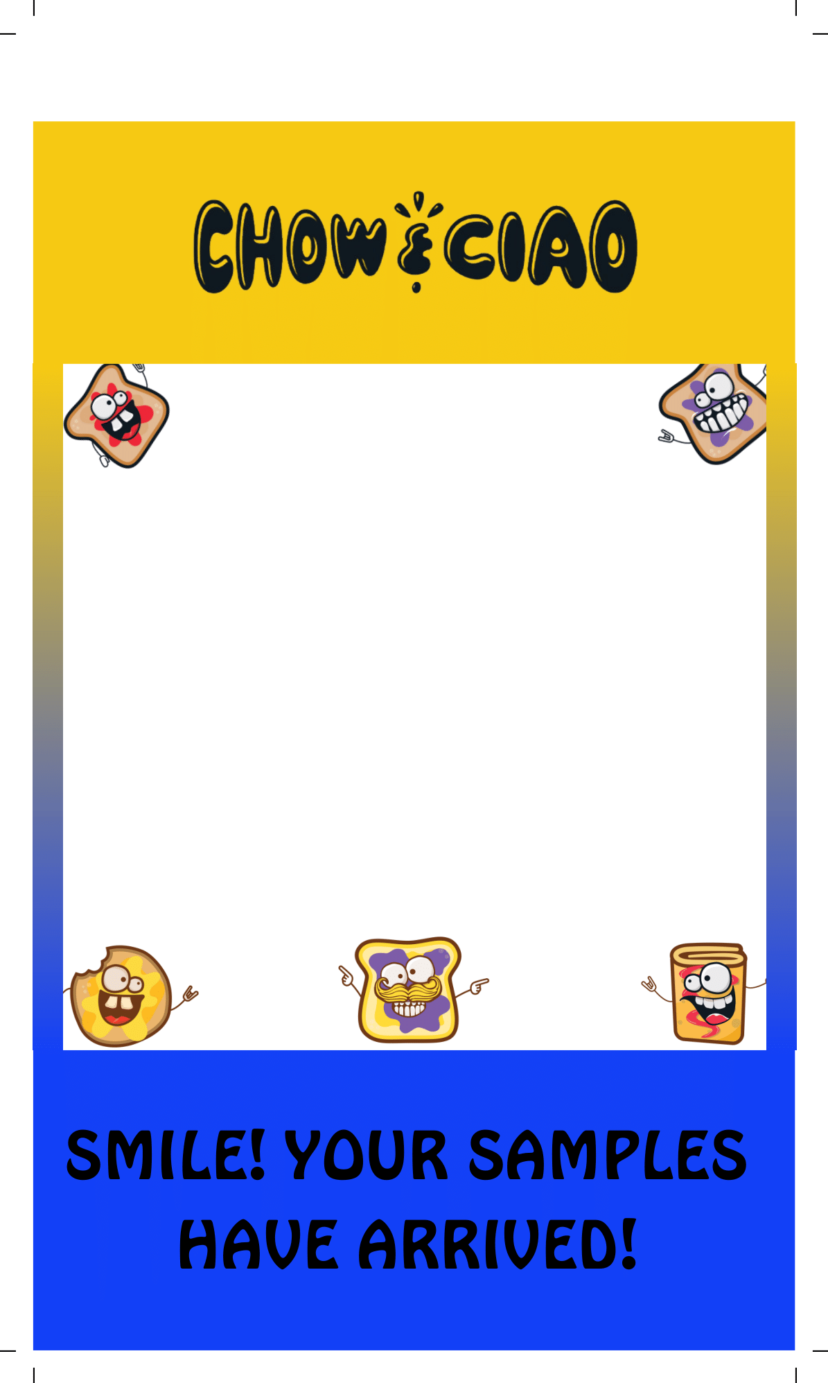
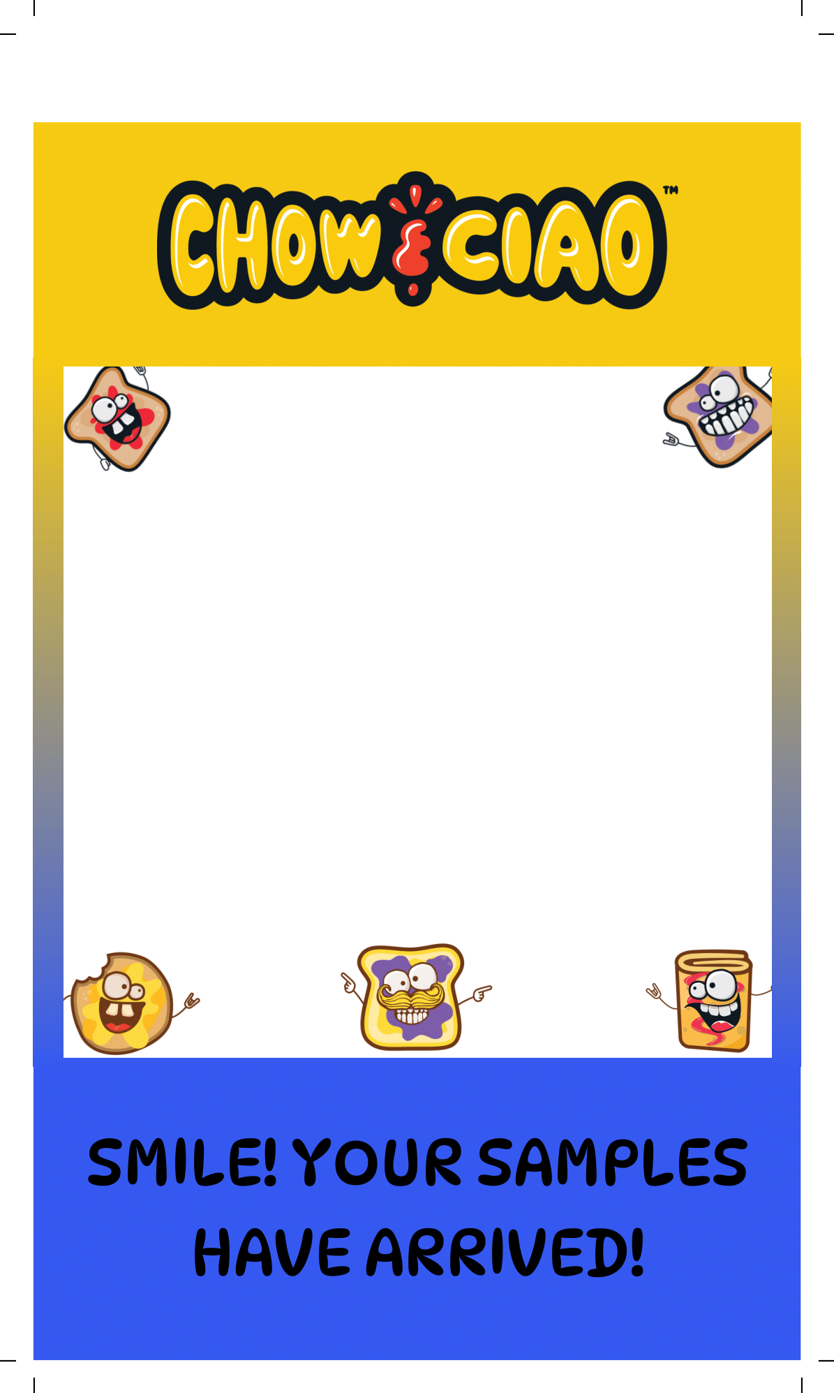
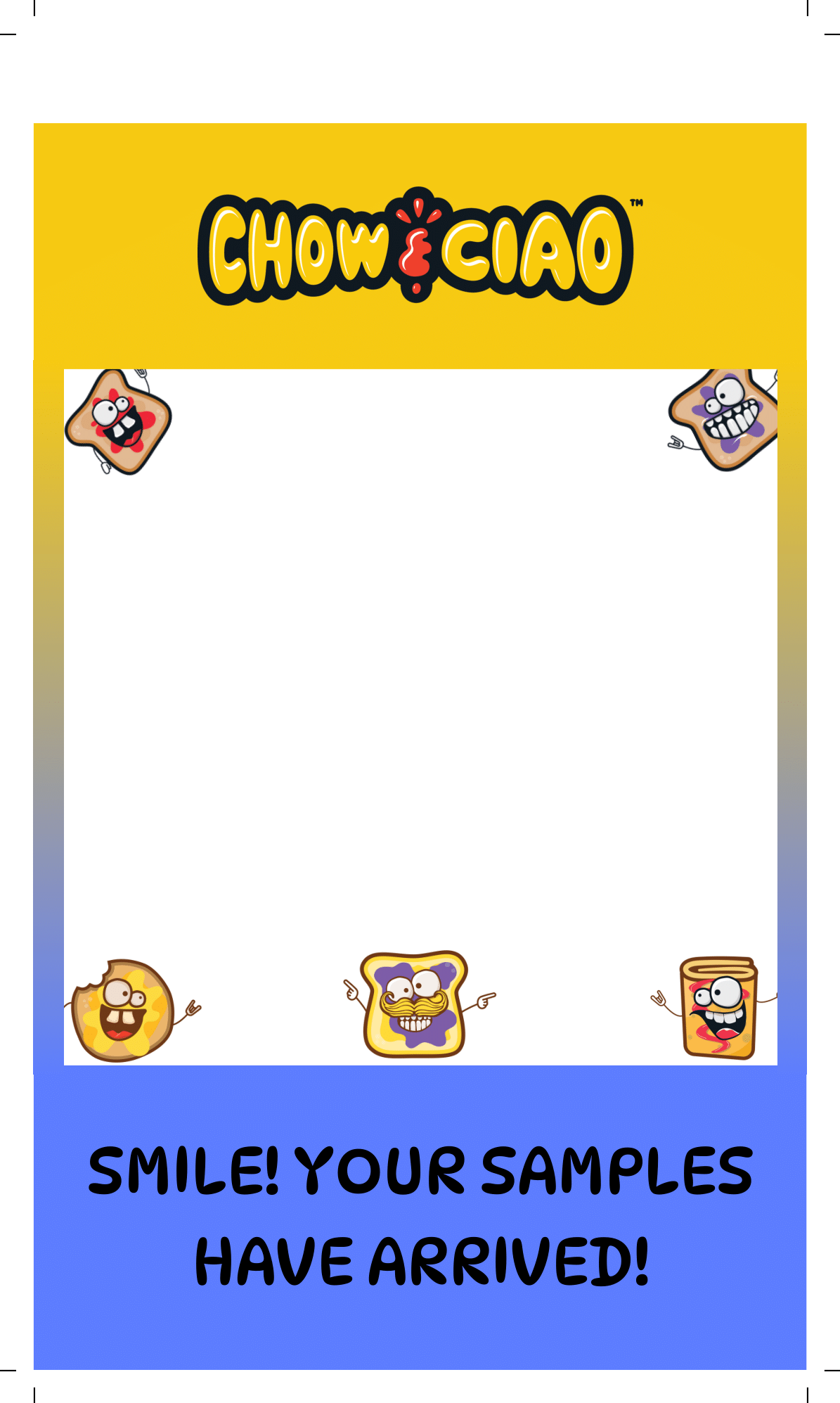
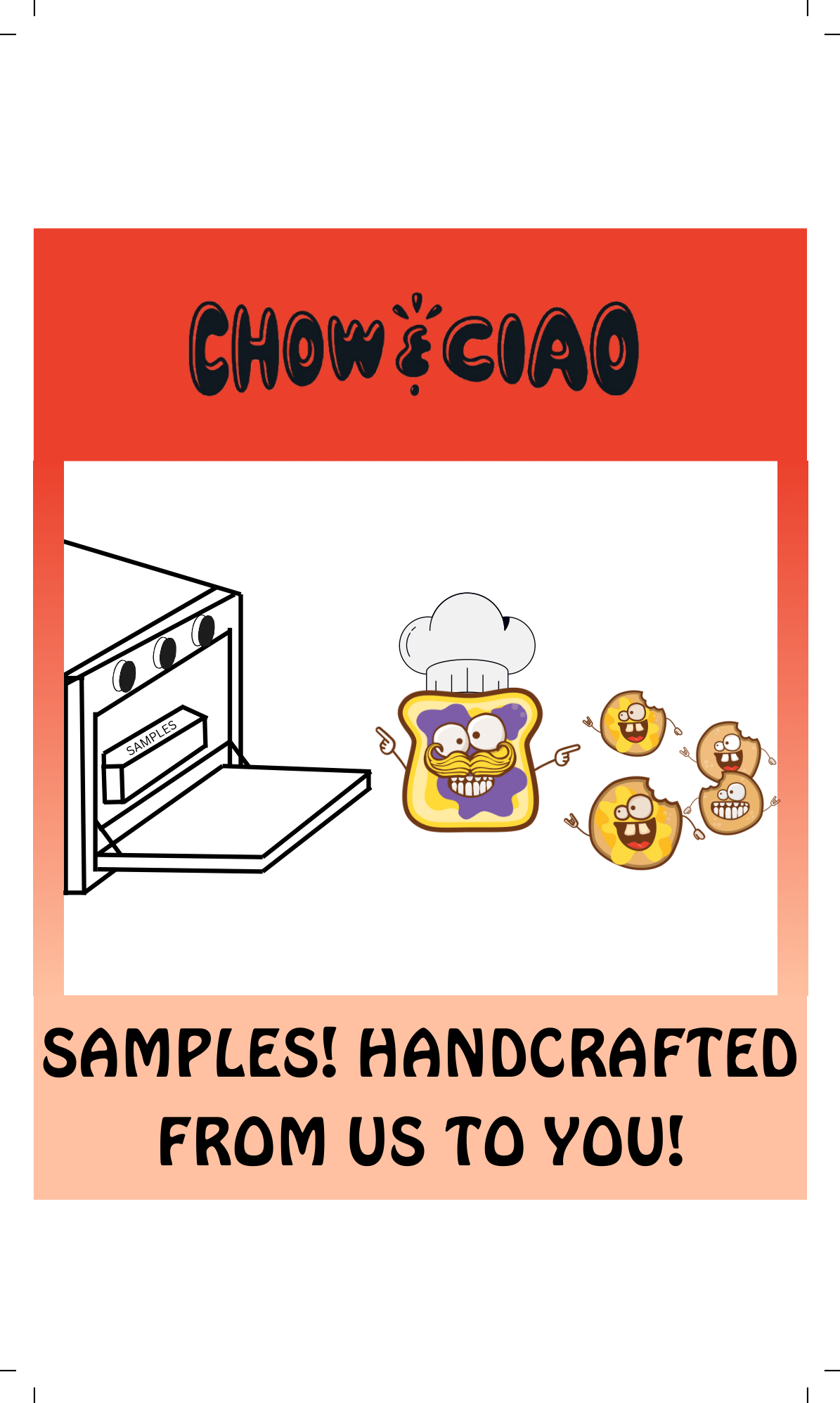
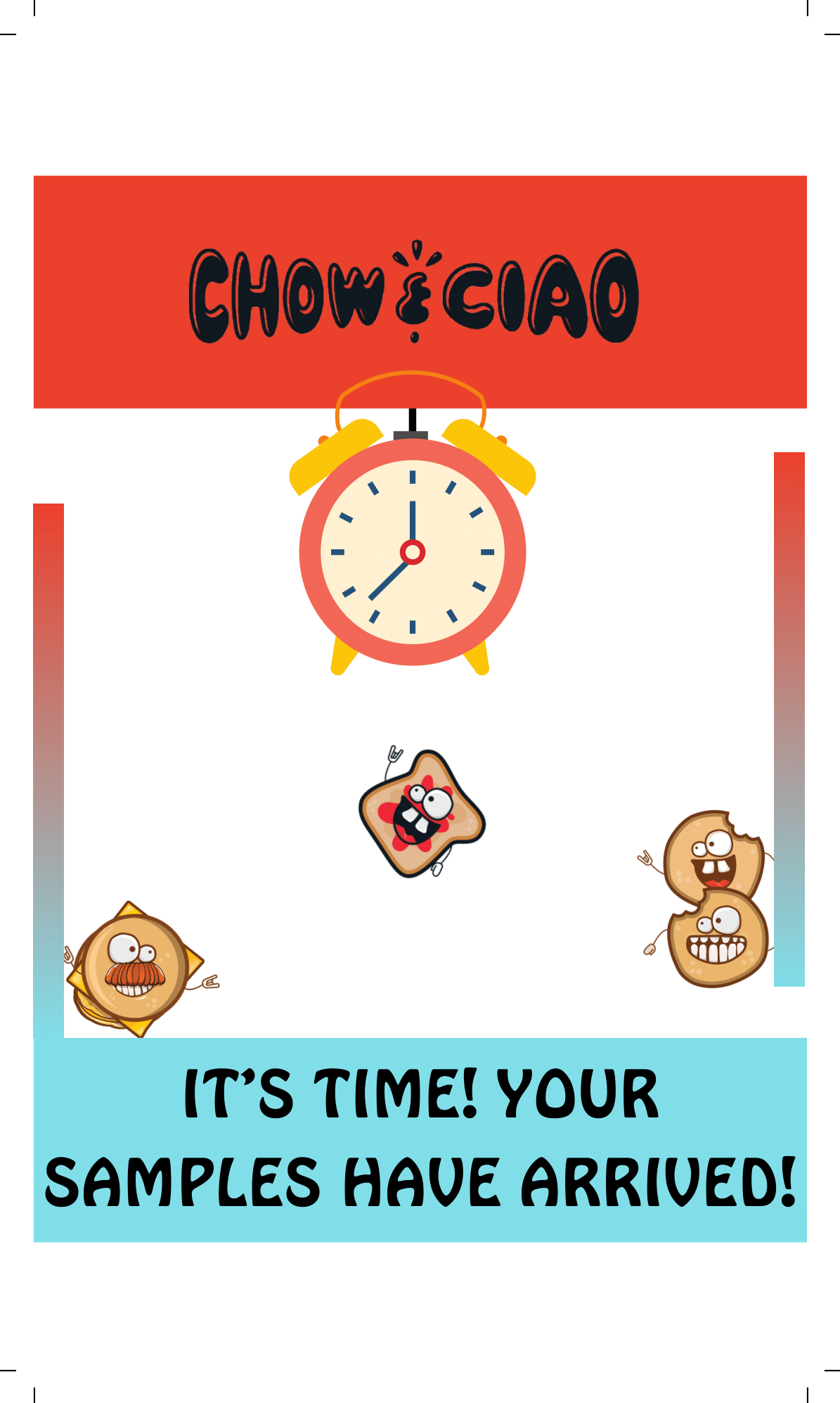
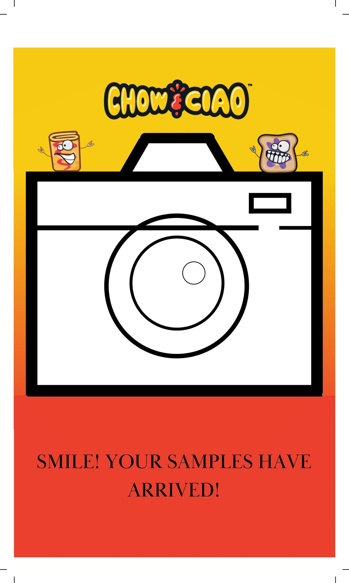
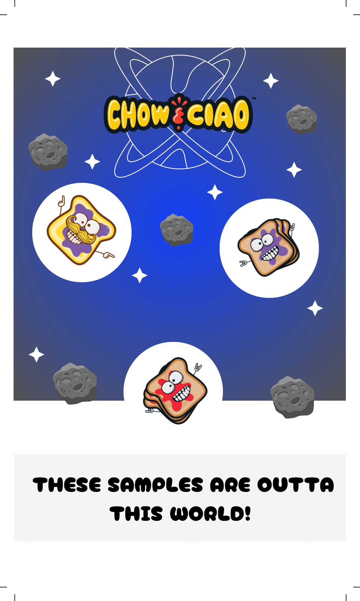
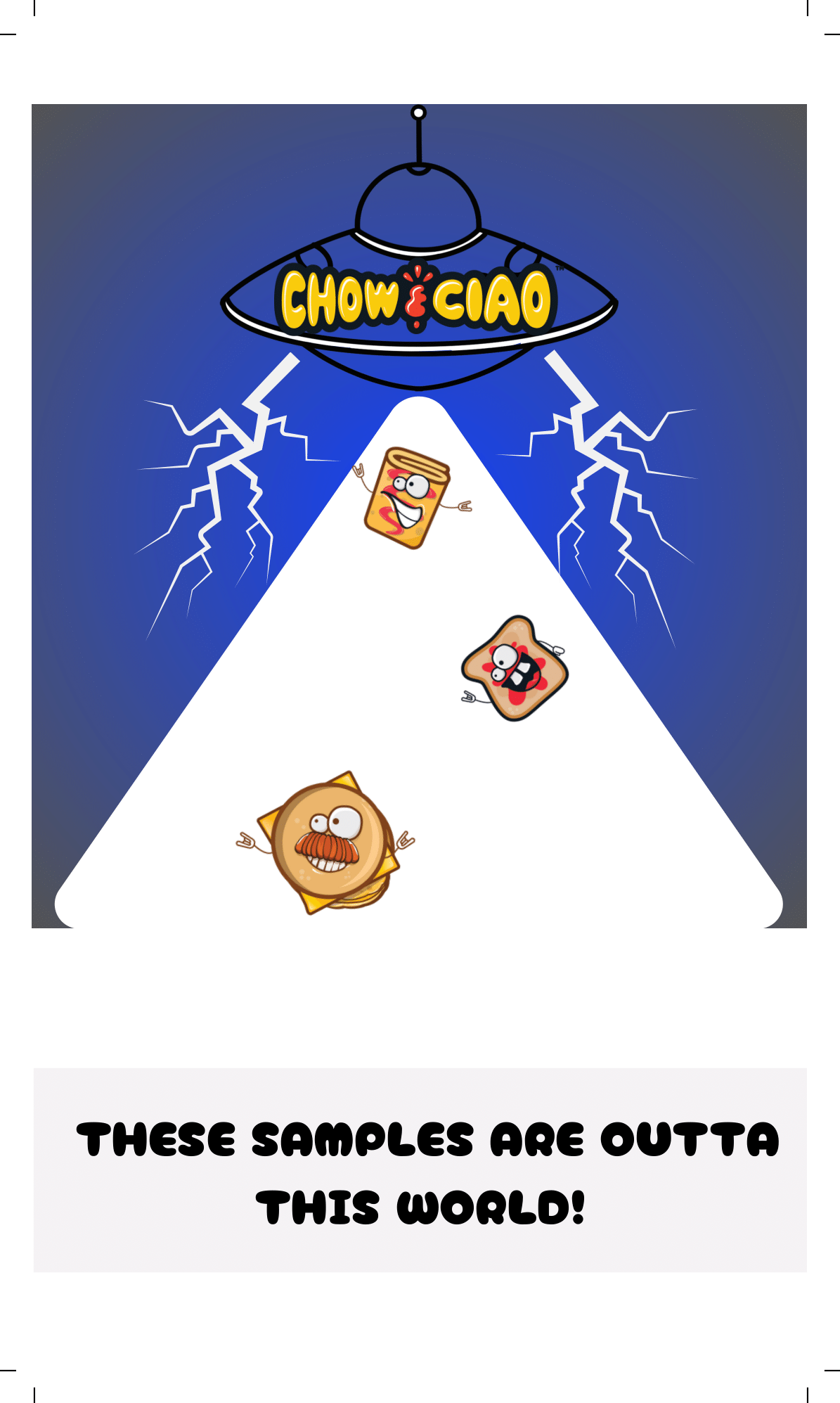
These graphics were printed on index cards and mailed to receivers of the samples we sent out!
These graphics were printed on index cards and mailed to receivers of the samples we sent out!
These were all drafts for the sample bags we were designing. The white spaces on the bags signified where there would be a window so the customer could look inside.
These were all drafts for the sample bags we were designing. The white spaces on the bags signified where there would be a window so the customer could look inside.
These were all drafts for the sample bags we were designing. The white spaces on the bags signified where there would be a window so the customer could look inside.
These were all drafts for the sample bags we were designing. The white spaces on the bags signified where there would be a window so the customer could look inside.
These were all drafts for the sample bags we were designing. The white spaces on the bags signified where there would be a window so the customer could look inside.
These were all drafts for the sample bags we were designing. The white spaces on the bags signified where there would be a window so the customer could look inside.
These were all drafts for the sample bags we were designing. The white spaces on the bags signified where there would be a window so the customer could look inside.
These were all drafts for the sample bags we were designing. The white spaces on the bags signified where there would be a window so the customer could look inside.
These were all drafts for the sample bags we were designing. The white spaces on the bags signified where there would be a window so the customer could look inside.
These were all drafts for the sample bags we were designing. The white spaces on the bags signified where there would be a window so the customer could look inside.
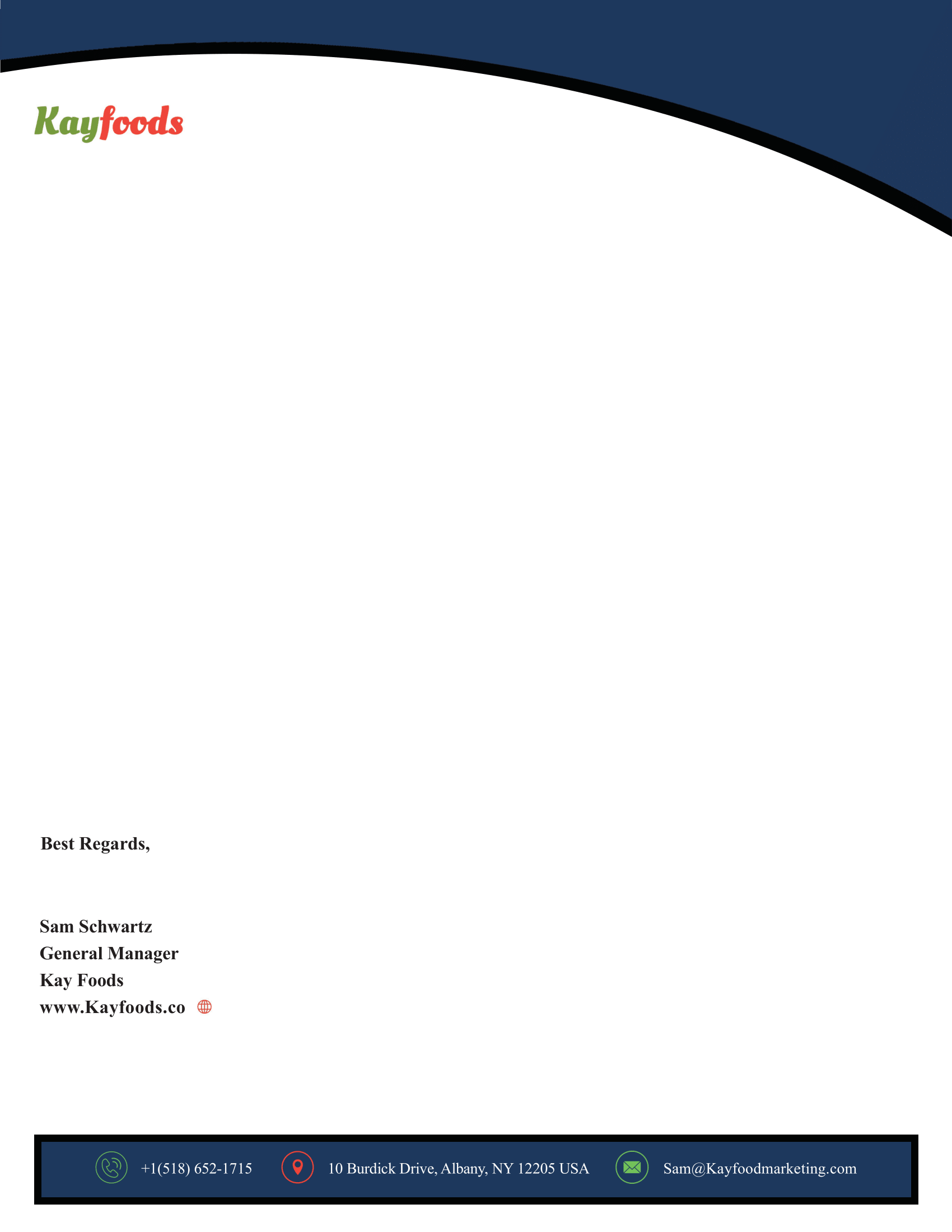
This was a basic letterhead I designed per the companies' specifications.
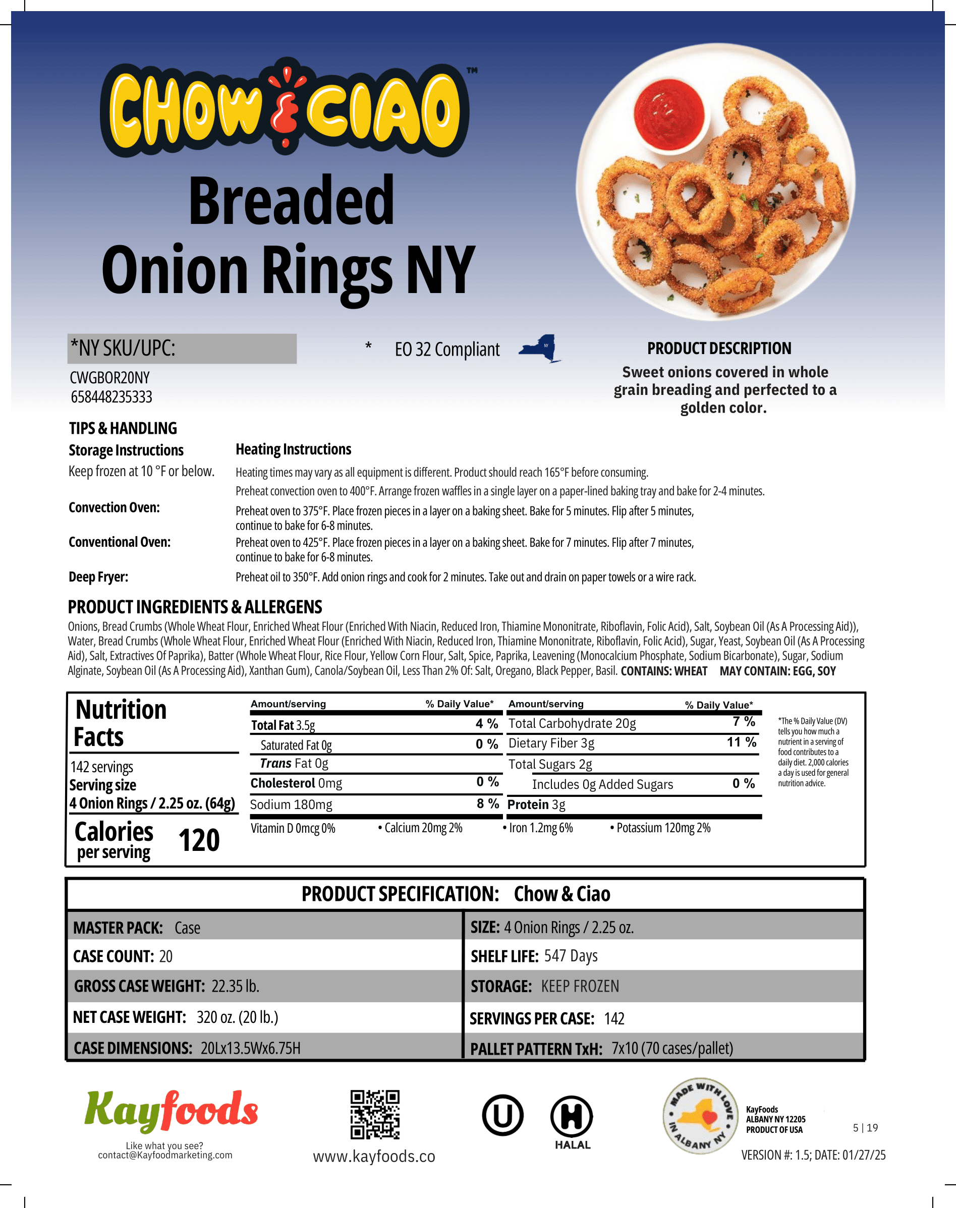
These are just two of the many different spec sheet design iterations I went through.